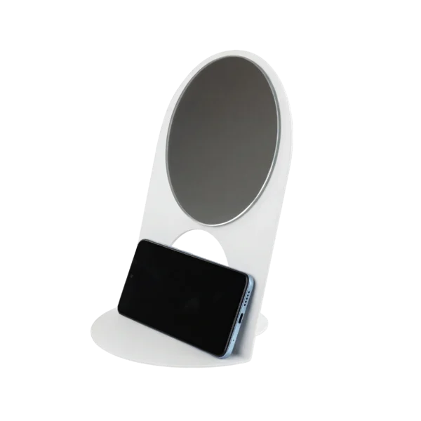
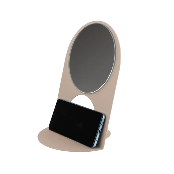
Color Matters: The Bold Palette of Blue Screen, Flame Red, and Salmon Orange in Your Home!
In modern interior design, we are moving away from safe but often impersonal solutions. The year 2026 is a time when the psychology of color in interiors ceases to be mere theory and becomes the foundation upon which we build our daily lives. While neutral colors and light grays have served as a safe base for years, contemporary interior arrangement increasingly invites intense shades inside. These hues do not just liven up a space, they have a real impact on our emotions and mental health. By offering furniture in Blue Screen, Flame Red and Salmon Orange, the Qsuli brand challenges boredom, proving that intense colors are the key to an interior with soul and character.
It is worth emphasizing that properly selected colors do more than just affect aesthetics, they can also optically enlarge a space and give rooms a cozy character. Thanks to this, even small apartments gain a new quality, and every piece of equipment becomes part of a coherent and harmonious whole. Introducing subtle accents in the form of Qsuli furniture allows for a balance between bold hues and subdued wall colors, creating the perfect backdrop for further arrangement with matching colours and natural wood elements.
Color psychology in interiors shows that the influence of colors on our emotions is incredibly strong. Therefore, it is worth consciously choosing hues that bring positive energy into the home without becoming overwhelming. Furniture in intense colors like Blue Screen, Flame Red, or Salmon Orange works brilliantly in any room when used in the right proportions, adding life while maintaining functionality and comfort.
In modern interiors, there is a growing emphasis on combining cooler tones with warm accents, allowing for a space full of contrast yet harmony. This combination ensures that interiors are not only aesthetic but also conducive to relaxation, support focus, and concentration. In this way, color psychology becomes a practical tool for creating a space that responds to the individual needs of residents and highlights their lifestyle, personality, and specific emotions.
Color Psychology: How Do Colors Affect Our Well-Being?
How colors affect the human brain has been the subject of research for decades. Color psychology in interiors is a science dedicated to studying how different hues impact our perception, emotions, behavior, and general well-being. Choosing the right colors directly translates into whether we can focus in a given room or, on the contrary, feel rising anxiety or fatigue. Our well-being is closely linked to the frequency of the light wave of a given color and its intensity, as well as learned associations shaped by cultural and natural influences.
Blue Screen (Electrifying Blue): Although cool colors and traditional shades of blue are associated with peace and tranquility, Blue Screen is a color also designed to spark creativity and stimulate the mind. This hue positively affects thought processes and productivity, making it ideal for home offices and spaces where concentration and inspiration are needed.


Flame Red (Fiery Red): This color has the strongest impact on our emotions and bodies. It adds energy, stimulates blood circulation and heart rate, and can raise adrenaline levels, resulting in increased motivation to act. In appropriate doses, it improves the mood and livens up an interior, giving it a dynamic character. However, too much red can cause tension and irritability, so it is best used as an accent.
Salmon Orange (Salmon Orange): This is a color associated with spring, optimism, and warmth. It introduces coziness and encourages relationship-building, making it an excellent choice for living rooms and shared spaces. Orange shades help raise energy and creativity levels without overwhelming the space.

Remember that intense colors do not have to introduce chaos to an interior. Properly selected hues create a coherent and balanced environment where the eye has a natural point of reference, and we feel comfortable. That is why it is so important to combine intense accents with a calm background – neutral, light, or pastel tones that soften the effect and maintain harmony in the space.
Furthermore, color psychology emphasizes that overly intense and saturated hues can overwhelm and cause irritation, therefore, the key to success is moderation and conscious application. Using the 60 – 30 – 10 rule – where 60% of the surface is the dominant color, 30% the secondary color, and 10% the accent color – helps maintain balance and aesthetics.
When choosing colors for your interior, consider the function of the room. For example, green and blue, known for their calming effects and ability to lower blood pressure, are ideal for bedrooms and relaxation areas. On the other hand, orange and red, which stimulate energy and appetite, work great in kitchens and dining rooms.
In summary, color psychology in interiors is not just a matter of aesthetics, but primarily a tool for creating a space conducive to well-being, concentration, and relaxation. The conscious use of color, combined with thoughtful design elements and good design principles, allows us to create interiors that not only look beautiful but also positively influence our daily lives.
How to Introduce Bold Color Without Overwhelming the Space?
Many of us fear that dark hues or a saturated red coffee table will dominate a room. However, expressive accents do not have to mean sacrificing lightness and harmony. On the contrary – when applied correctly, they can become a key element of the arrangement that gives the interior character and depth. Practical ideas from designers suggest treating bold color as “jewelry for the home” – a subtle but distinct detail that draws attention and highlights the stylish reflection of the space

In small apartments dominated by lighter colors used to optically enlarge the space, a single piece of furniture in Flame Red can work wonders. Such an expressive element not only livens up the interior but also adds a sense of lightness to the space by focusing the gaze on a single designer detail, drawing attention away from the limited dimensions of the room. If your base consists of warm grays or neutral tones, a table in the saturated shade of Blue Screen will create a harmonious backdrop for the rest of the furnishings, introducing freshness and modernity. Their versatility allows for seamless blending with various styles – from minimalist to industrial – without the risk of an aesthetic failure.
Additionally, keep the principles of moderation and proportion in mind. The 60-30-10 rule works perfectly when introducing intense colors. This ensures the interior does not lose its balance and avoids a chaotic effect. In practice, this means that even the most saturated colors, such as Flame Red or Salmon Orange, can harmonize perfectly with a neutral background, creating a space full of energy and peace alike.
Light – both natural and artificial – is also significant. Proper lighting can change the perception of a color, brightening darker shades and softening the intensity of brighter ones. It is therefore worth planning the placement of furniture and light sources so that they highlight the assets of expressive colors without overwhelming the inhabitants.

Finally, color psychology emphasizes that colors like red, blue, or green have the power to influence our emotions and energy levels. Introducing them to an interior through furniture or accessories can significantly improve well-being, stimulate creativity, and promote relaxation. Therefore, it is worth taking the risk and letting bold accents become an integral part of your home, creating a space that is not only aesthetic but also full of positive energy and hope.
Contrast and Harmony: What to Pair with Qsuli’s Bold Palette?
Creating a space that is coherent and harmonious requires an understanding of the relationship between materials and colors. Qsuli metal furniture, made of durable steel, composes perfectly with accessories of a natural character, which warm up the interior and make it cozy while highlighting the modern design.

Earthy Pairings: Salmon Orange, inspired by the color of spring and nature, looks best in the company of olive and muted greens, as well as warm beiges and light browns. Such a mix not only creates a coherent color palette but also introduces harmony and “less chaos” into the interior, promoting relaxation and well-being.
Classic Contrast: Intense Blue Screen gains clarity when set against a backdrop of light grays, off-whites, or delicate beiges. Combining metal with soft linen cushions and natural textures breaks the coldness of raw materials, creating a space full of balance and elegance.


Depth and Luxury: The bold pairing of Flame Red with forest green or dark green introduces an aura of mystery and sophistication. These dark colors harmonize perfectly with metal furniture, emphasizing its industrial character while giving the room coziness and comfort.
Neutral Background: To maintain balance and avoid oversaturation, use neutral tones like off-white, gray, or beige. These serve as the ideal backdrop, allowing intense colors to shine while introducing peace and reducing chaos, which is key for the comfort of the residents.

The roles of daylight and artificial light cannot be ignored. Natural light enhances the vividness of cool colors and adds depth to warm ones, while properly selected evening lighting can completely transform the perception of a space. Thanks to this, intense Qsuli colors like Blue Screen, Flame Red, or Salmon Orange can change their character – from energetic and stimulating to soothing and conducive to rest.
It is also worth remembering that color psychology in interiors emphasizes the importance of conscious color use to introduce harmony and balance rather than chaos. Therefore, combining intense accents with natural materials and subdued colors is the key to creating a space that is not only aesthetic but also promotes well-being and regeneration.
Why Is It Worth Taking the Risk?
Trends are increasingly moving away from sterile, catalog-like interiors in favor of personalization and individual expression. Choosing the right colors becomes a declaration: “This is my home; I rule here, and so do my emotions.” While delicate pastels and powder pink introduce subtlety and peace, it is intense colors that give an interior authenticity, character, and the energy that affects our daily well-being.
An excellent alternative treatment is to introduce color on a single wall or through one expressive piece of furniture that becomes the focal point of the interior. Such color accents allow for experimentation without the risk of overwhelming the space. See how colors affect your emotions and functionality – will Salmon Orange give your morning coffee a unique flavor and warmth? Will Blue Screen help you finish a project faster and more effectively by stimulating creativity and focus? Or perhaps Flame Red will add energy and motivation to act in your home office or living room?
Remember the role of warm colors, which harmonize beautifully with intense hues to create a balanced and cozy atmosphere. Warm beiges and light gray are the perfect backdrop to balance expressive shades, maintaining an equilibrium between dynamics and peace. Meanwhile, dark tones can add depth and elegance to an interior, highlighting the individual style and character of the space.

By introducing Qsuli color accents to your home, you gain more than just a designer piece of equipment; you gain a tool to create mood and emotion. It is an investment in a space that promotes relaxation, stimulates creativity, and adds energy – all thanks to the conscious use of color psychology in interiors.
Allow yourself to be brave and experiment with the colors that best suit your needs and lifestyle. Let your home be a place where color matters, and every day gains a new quality thanks to properly selected accents and color harmony, surrounded by durable and unique functional art.
Your Space, Your Energy!
Investing in a bold color palette is an investment in our well-being. Qsuli furniture not only introduces harmony through precision craftsmanship and durability but, above all, adds energy where it is needed most. The practical tips are simple: do not be afraid, experiment, and remember that proper lighting and natural materials are the best allies of saturated hues.
It is worth making changes today. Let the off-white of your walls find company that matters. The best homes are those where color psychology serves the residents, not just the fashion. Choose Qsuli and feel how strongly orange, red, or blue can transform your reality and help you feel fresh every day.
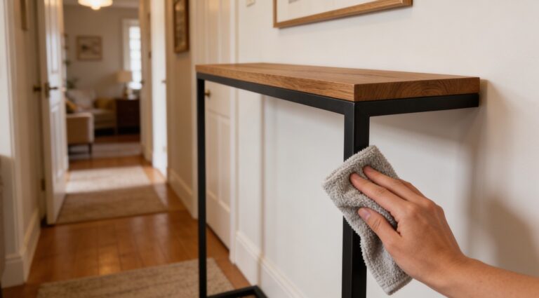
Defining space with a single line. Minimalist frames, maximum strength.